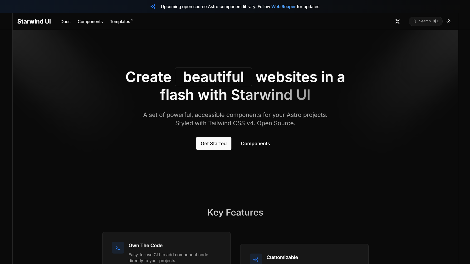
One component library for every framework you ship
Accessible components with polished defaults and code you own. Style them your way and ship the same great experience everywhere.
Get Started
npx starwind@latest init
55 styled components 36 accessible primitives
---import { Switch } from "@/components/starwind/switch";---
<Switch id="astro-switch" label="Airplane mode" />
import { Switch } from "@/components/starwind/switch";
export function Example() { return <Switch id="react-switch" label="Airplane mode" />;}<script setup lang="ts">import { Switch } from "@/components/starwind/switch";</script>
<template> <Switch id="vue-switch" label="Airplane mode" /></template><script lang="ts"> import { Switch } from "@/components/starwind/switch";</script>
<Switch id="svelte-switch" label="Airplane mode" /><span id="html-switch" data-sw-switch role="switch" aria-label="Airplane mode"> <span data-sw-switch-thumb></span> <input data-sw-switch-input type="checkbox" /></span>
<script type="module"> import { initStarwind } from "@starwind-ui/runtime"; initStarwind();</script>