Image

---import pricingImage from "@/assets/images/pricing-9.jpg";import { Image } from "@/components/starwind/image";---
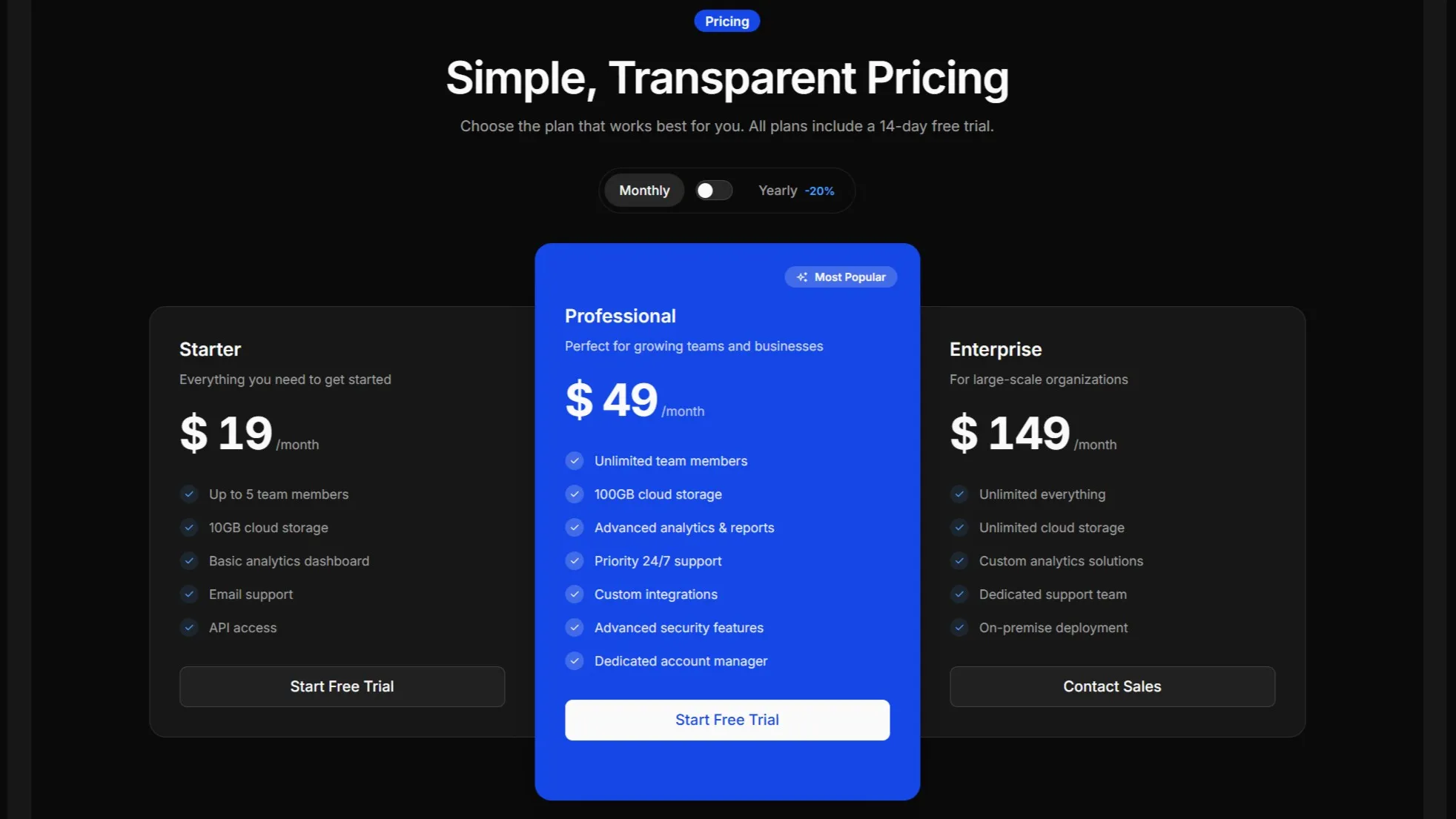
<Image src={pricingImage} alt="Pricing illustration" class="rounded-lg" />
Installation
pnpx starwind@latest add imagenpx starwind@latest add imageyarn dlx starwind@latest add imageUsage
General Notes
The Image component is a thin wrapper around Astro’s built-in <Image /> component. It provides:
- Automatic size inference:
inferSizeis enabled by default, so you don’t need to specify width and height for remote images - Responsive defaults: Images are set to
w-full h-autofor responsive behavior - Optimized output: Leverages Astro’s image optimization pipeline
Remote URL
You can use remote URLs directly. The component will automatically infer the image dimensions.

---import { Image } from "@/components/starwind/image";---
<Image  src="https://images.unsplash.com/photo-1588345921523-c2dcdb7f1dcd?w=800&dpr=2&q=80"  alt="Sleek gray design"  class="rounded-lg"/>
API Reference
Image
A wrapper around Astro’s Image component with sensible defaults and responsive styling.
| Prop | Type | Default |
|---|---|---|
src | ImageMetadata | string | - |
alt | string | "" |
inferSize | boolean | true |
class | string | - |
<Image src={imageSource} alt="Description of image" class="rounded-lg"/>Additional Notes:
src: Image source. Accepts imported image assets or remote URLsalt: Alternative text for accessibility. Always provide meaningful alt textinferSize: Whentrue, automatically infers width and height for remote images. Disable if you want to specify dimensions manually
All other props from Astro’s <Image /> component are also supported (e.g., width, height, format, quality).
Changelog
v1.0.0
- Initial release with starwind v1.13.0