Sidebar
---import BellIcon from "@tabler/icons/outline/bell.svg";import BookOpenIcon from "@tabler/icons/outline/book.svg";import ChartPieIcon from "@tabler/icons/outline/chart-pie.svg";import ChevronRightIcon from "@tabler/icons/outline/chevron-right.svg";import ChevronUpIcon from "@tabler/icons/outline/chevron-up.svg";import CodeIcon from "@tabler/icons/outline/code.svg";import CreditCardIcon from "@tabler/icons/outline/credit-card.svg";import FrameIcon from "@tabler/icons/outline/frame.svg";import LogoutIcon from "@tabler/icons/outline/logout.svg";import MapIcon from "@tabler/icons/outline/map.svg";import BotIcon from "@tabler/icons/outline/robot.svg";import BadgeCheckIcon from "@tabler/icons/outline/rosette-discount-check.svg";import Settings2Icon from "@tabler/icons/outline/settings-2.svg";import SparklesIcon from "@tabler/icons/outline/sparkles.svg";import TerminalIcon from "@tabler/icons/outline/terminal-2.svg";
import { Avatar, AvatarFallback, AvatarImage } from "@/components/starwind/avatar";import {  Collapsible,  CollapsibleContent,  CollapsibleTrigger,} from "@/components/starwind/collapsible";import {  Dropdown,  DropdownContent,  DropdownItem,  DropdownLabel,  DropdownSeparator,  DropdownTrigger,} from "@/components/starwind/dropdown";import {  Sidebar,  SidebarContent,  SidebarFooter,  SidebarGroup,  SidebarGroupContent,  SidebarGroupLabel,  SidebarHeader,  SidebarMenu,  SidebarMenuButton,  SidebarMenuItem,  SidebarMenuSub,  SidebarMenuSubButton,  SidebarMenuSubItem,  SidebarProvider,  SidebarRail,  SidebarSeparator,  SidebarTrigger,} from "@/components/starwind/sidebar";
const navMain = [  {    title: "Playground",    url: "#",    icon: TerminalIcon,    isActive: true,    items: [      { title: "History", url: "#" },      { title: "Starred", url: "#" },      { title: "Settings", url: "#" },    ],  },  {    title: "Models",    url: "#",    icon: BotIcon,    items: [      { title: "Genesis", url: "#" },      { title: "Explorer", url: "#" },      { title: "Quantum", url: "#" },    ],  },  {    title: "Documentation",    url: "#",    icon: BookOpenIcon,    items: [      { title: "Introduction", url: "#" },      { title: "Get Started", url: "#" },      { title: "Tutorials", url: "#" },      { title: "Changelog", url: "#" },    ],  },  {    title: "Settings",    url: "#",    icon: Settings2Icon,    items: [      { title: "General", url: "#" },      { title: "Team", url: "#" },      { title: "Billing", url: "#" },      { title: "Limits", url: "#" },    ],  },];
const projects = [  { name: "Design Engineering", url: "#", icon: FrameIcon },  { name: "Sales & Marketing", url: "#", icon: ChartPieIcon },  { name: "Travel", url: "#", icon: MapIcon },];---
<SidebarProvider>  <Sidebar collapsible="icon">    <SidebarHeader>      <SidebarMenu>        <SidebarMenuItem>          <SidebarMenuButton size="lg">            <div              class="bg-sidebar-primary text-sidebar-primary-foreground flex aspect-square size-10 items-center justify-center rounded-lg"            >              <CodeIcon class="size-5" />            </div>            <div class="grid flex-1 text-left text-sm leading-tight">              <span class="truncate font-semibold">Starwind UI</span>              <span class="text-sidebar-foreground/70 truncate text-xs">Enterprise</span>            </div>          </SidebarMenuButton>        </SidebarMenuItem>      </SidebarMenu>    </SidebarHeader>
    <SidebarSeparator />
    <SidebarContent>      <SidebarGroup>        <SidebarGroupLabel>Platform</SidebarGroupLabel>        <SidebarGroupContent>          <SidebarMenu>            {              navMain.map((item) => (                <Collapsible defaultOpen={item.isActive} class="group/collapsible">                  <SidebarMenuItem>                    <CollapsibleTrigger asChild>                      <SidebarMenuButton tooltip={item.title}>                        <item.icon />                        <span>{item.title}</span>                        <ChevronRightIcon class="ml-auto transition-transform duration-200 group-data-[state=open]/collapsible:rotate-90" />                      </SidebarMenuButton>                    </CollapsibleTrigger>                    {item.items && (                      <CollapsibleContent>                        <SidebarMenuSub>                          {item.items.map((subItem) => (                            <SidebarMenuSubItem>                              <SidebarMenuSubButton href={subItem.url}>                                <span>{subItem.title}</span>                              </SidebarMenuSubButton>                            </SidebarMenuSubItem>                          ))}                        </SidebarMenuSub>                      </CollapsibleContent>                    )}                  </SidebarMenuItem>                </Collapsible>              ))            }          </SidebarMenu>        </SidebarGroupContent>      </SidebarGroup>
      <SidebarGroup class="group-data-[collapsible=icon]:hidden">        <SidebarGroupLabel>Projects</SidebarGroupLabel>        <SidebarGroupContent>          <SidebarMenu>            {              projects.map((project) => (                <SidebarMenuItem>                  <SidebarMenuButton href={project.url} tooltip={project.name}>                    <project.icon />                    <span>{project.name}</span>                  </SidebarMenuButton>                </SidebarMenuItem>              ))            }          </SidebarMenu>        </SidebarGroupContent>      </SidebarGroup>    </SidebarContent>
    <SidebarFooter>      <SidebarMenu>        <SidebarMenuItem>          <Dropdown>            <DropdownTrigger asChild>              <SidebarMenuButton size="lg">                <Avatar class="size-10 shrink-0 rounded-lg">                  <AvatarImage src="https://github.com/boston343.png" alt="boston343" />                  <AvatarFallback class="rounded-lg">B3</AvatarFallback>                </Avatar>                <div class="grid flex-1 text-left text-sm leading-tight">                  <span class="truncate font-semibold">Boston343</span>                  <span class="text-sidebar-foreground/70 truncate text-xs">@boston343</span>                </div>                <ChevronUpIcon class="ml-auto size-4" />              </SidebarMenuButton>            </DropdownTrigger>            <DropdownContent class="w-full min-w-48 rounded-lg" side="top">              <DropdownLabel class="p-0 font-normal">                <div class="flex items-center gap-2 px-1 py-1.5 text-left text-sm">                  <Avatar class="size-8 rounded-lg">                    <AvatarImage src="https://github.com/boston343.png" alt="boston343" />                    <AvatarFallback class="rounded-lg">B3</AvatarFallback>                  </Avatar>                  <div class="grid flex-1 text-left text-sm leading-tight">                    <span class="truncate font-semibold">boston343</span>                    <span class="text-muted-foreground truncate text-xs">@boston343</span>                  </div>                </div>              </DropdownLabel>              <DropdownSeparator />              <DropdownItem as="a" href="#">                <SparklesIcon class="mr-2 size-4" />                Upgrade to Pro              </DropdownItem>              <DropdownSeparator />              <DropdownItem as="a" href="#">                <BadgeCheckIcon class="mr-2 size-4" />                Account              </DropdownItem>              <DropdownItem as="a" href="#">                <CreditCardIcon class="mr-2 size-4" />                Billing              </DropdownItem>              <DropdownItem as="a" href="#">                <BellIcon class="mr-2 size-4" />                Notifications              </DropdownItem>              <DropdownSeparator />              <DropdownItem as="a" href="#">                <LogoutIcon class="mr-2 size-4" />                Log out              </DropdownItem>            </DropdownContent>          </Dropdown>        </SidebarMenuItem>      </SidebarMenu>    </SidebarFooter>
    <SidebarRail />  </Sidebar>
  <main class="bg-background flex flex-1 flex-col">    <header class="flex h-12 shrink-0 items-center gap-2 border-b px-4">      <SidebarTrigger />      <span class="text-muted-foreground text-sm">Main Content</span>    </header>    <div class="flex-1 p-6">      <p class="text-muted-foreground text-sm">        Use <kbd class="bg-muted rounded px-1.5 py-0.5 text-xs font-medium">Ctrl+B</kbd> to toggle        the sidebar <br /> after clicking in this window.      </p>    </div>  </main></SidebarProvider>
Sidebars are one of the most complex components to build. They are central to any application and often contain a lot of moving parts.
The Starwind Sidebar is composable, themeable, and customizable.
Info
The Starwind Sidebar is extremely similar to the shadcn/ui sidebar component.
Installation
pnpx starwind@latest add sidebarnpx starwind@latest add sidebaryarn dlx starwind@latest add sidebarAdd the following colors to your global CSS file (usually src/styles/starwind.css) if they do not already exist:
Info
They may not exist if you are adding the sidebar to an existing project. For new projects the starwind init command automatically adds this setup.
@theme inline {  /* other variables... */
  --color-sidebar: var(--sidebar-background);  --color-sidebar-foreground: var(--sidebar-foreground);  --color-sidebar-primary: var(--sidebar-primary);  --color-sidebar-primary-foreground: var(--sidebar-primary-foreground);  --color-sidebar-accent: var(--sidebar-accent);  --color-sidebar-accent-foreground: var(--sidebar-accent-foreground);  --color-sidebar-border: var(--sidebar-border);  --color-sidebar-outline: var(--sidebar-outline);}
:root {  /* other variables... */
  /* sidebar variables */  --sidebar-background: var(--color-neutral-50);  --sidebar-foreground: var(--color-neutral-950);  --sidebar-primary: var(--color-blue-700);  --sidebar-primary-foreground: var(--color-neutral-50);  --sidebar-accent: var(--color-neutral-100);  --sidebar-accent-foreground: var(--color-neutral-900);  --sidebar-border: var(--color-neutral-200);  --sidebar-outline: var(--color-neutral-400);}
.dark {  /* other variables... */
  /* sidebars variables */  --sidebar-background: var(--color-neutral-900);  --sidebar-foreground: var(--color-neutral-50);  --sidebar-primary: var(--color-blue-700);  --sidebar-primary-foreground: var(--color-neutral-50);  --sidebar-accent: var(--color-neutral-800);  --sidebar-accent-foreground: var(--color-neutral-100);  --sidebar-border: var(--color-neutral-800);  --sidebar-outline: var(--color-neutral-600);}
Structure
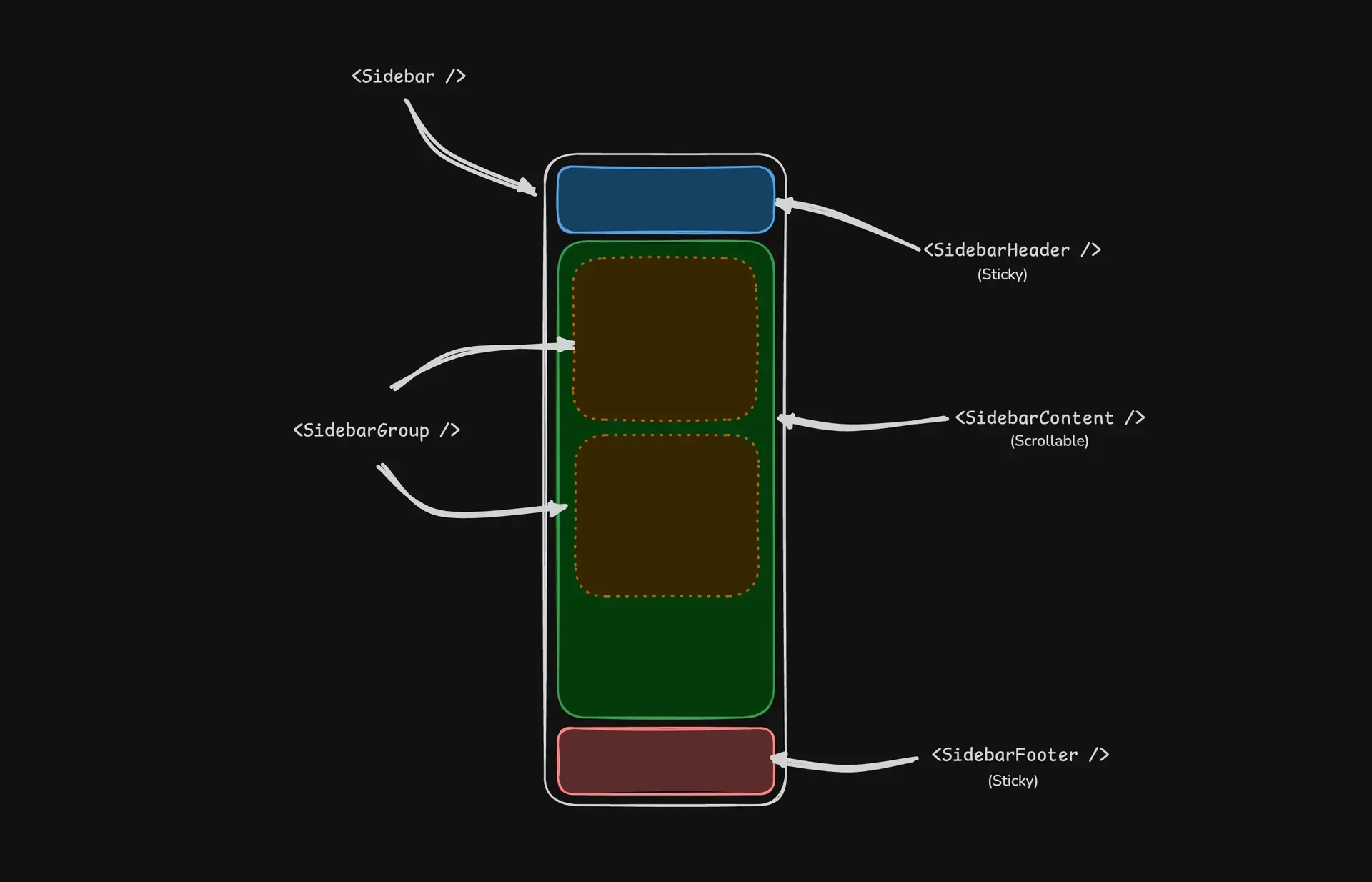
A Sidebar component is composed of the following parts:
SidebarProvider- Handles collapsible state and keyboard shortcutsSidebar- The sidebar containerSidebarHeaderandSidebarFooter- Sticky at the top and bottom of the sidebarSidebarContent- Scrollable content areaSidebarGroup- Section within theSidebarContentSidebarTrigger- Button to toggle the sidebar
Usage
Basic Layout
Wrap your application with SidebarProvider and place Sidebar alongside your main content:
---import {  Sidebar,  SidebarContent,  SidebarProvider,  SidebarTrigger,} from "@/components/starwind/sidebar";import { AppSidebar } from "@/components/app-sidebar";---
<SidebarProvider>  <AppSidebar />  <main>    <SidebarTrigger />    <slot />  </main></SidebarProvider>
Creating a Sidebar Component
---import {  Sidebar,  SidebarContent,  SidebarFooter,  SidebarGroup,  SidebarHeader,} from "@/components/starwind/sidebar";---
<Sidebar>  <SidebarHeader />  <SidebarContent>    <SidebarGroup />    <SidebarGroup />  </SidebarContent>  <SidebarFooter /></Sidebar>
With Menu Items
Use SidebarMenu, SidebarMenuItem, and SidebarMenuButton to create navigation menus:
---import CalendarIcon from "@tabler/icons/outline/calendar.svg";import CodeIcon from "@tabler/icons/outline/code.svg";import HomeIcon from "@tabler/icons/outline/home.svg";import InboxIcon from "@tabler/icons/outline/inbox.svg";import SearchIcon from "@tabler/icons/outline/search.svg";import SettingsIcon from "@tabler/icons/outline/settings.svg";
import {  Sidebar,  SidebarContent,  SidebarGroup,  SidebarGroupContent,  SidebarGroupLabel,  SidebarHeader,  SidebarMenu,  SidebarMenuButton,  SidebarMenuItem,  SidebarProvider,  SidebarTrigger,} from "@/components/starwind/sidebar";
const items = [  { title: "Home", url: "#", icon: HomeIcon },  { title: "Inbox", url: "#", icon: InboxIcon },  { title: "Calendar", url: "#", icon: CalendarIcon },  { title: "Search", url: "#", icon: SearchIcon },  { title: "Settings", url: "#", icon: SettingsIcon },];---
<SidebarProvider>  <Sidebar collapsible="icon">    <SidebarHeader>      <SidebarMenu>        <SidebarMenuItem>          <SidebarMenuButton size="lg">            <div              class="bg-sidebar-primary text-sidebar-primary-foreground flex aspect-square size-10 items-center justify-center rounded-lg"            >              <CodeIcon class="size-5" />            </div>            <div class="grid flex-1 text-left text-sm leading-tight">              <span class="truncate font-semibold">Starwind UI</span>              <span class="text-sidebar-foreground/70 truncate text-xs">Enterprise</span>            </div>          </SidebarMenuButton>        </SidebarMenuItem>      </SidebarMenu>    </SidebarHeader>
    <SidebarContent>      <SidebarGroup>        <SidebarGroupLabel>Application</SidebarGroupLabel>        <SidebarGroupContent>          <SidebarMenu>            {              items.map((item) => (                <SidebarMenuItem>                  <SidebarMenuButton href={item.url}>                    <item.icon />                    <span>{item.title}</span>                  </SidebarMenuButton>                </SidebarMenuItem>              ))            }          </SidebarMenu>        </SidebarGroupContent>      </SidebarGroup>    </SidebarContent>  </Sidebar>
  <main class="bg-background flex flex-1 flex-col">    <header class="flex h-12 shrink-0 items-center gap-2 border-b px-4">      <SidebarTrigger />      <span class="text-muted-foreground text-sm">Main Content</span>    </header>    <div class="flex-1 p-6">      <p class="text-muted-foreground text-sm">        Use <kbd class="bg-muted rounded px-1.5 py-0.5 text-xs font-medium">Ctrl+B</kbd> to toggle        the sidebar <br /> after clicking in this window.      </p>    </div>  </main></SidebarProvider>
With Inset Variant
When using the inset variant, wrap your main content in SidebarInset:
---import {  Sidebar,  SidebarInset,  SidebarProvider,} from "@/components/starwind/sidebar";---
<SidebarProvider>  <Sidebar variant="inset">    {/* Sidebar content */}  </Sidebar>  <SidebarInset>    <main>{/* Main content */}</main>  </SidebarInset></SidebarProvider>
API Reference
SidebarProvider
The root component that provides sidebar state and handles keyboard shortcuts.
| Prop | Type | Default |
|---|---|---|
defaultOpen | boolean | true |
keyboardShortcut | string | "b" |
class | string | - |
<SidebarProvider defaultOpen={true} keyboardShortcut="b"> {/* Sidebar and content */}</SidebarProvider>Additional Notes:
defaultOpen: Controls whether the sidebar starts expanded or collapsedkeyboardShortcut: The key used withCmd(Mac) orCtrl(Windows) to toggle the sidebar
Width
Control the sidebar width using CSS variables on SidebarProvider:
<SidebarProvider style={{ "--sidebar-width": "20rem", "--sidebar-width-icon": "4rem", }}> <Sidebar /></SidebarProvider>| Variable | Default | Description |
|---|---|---|
--sidebar-width | 18rem | Width of the expanded sidebar |
--sidebar-width-icon | 3.5rem | Width when collapsed to icons |
Keyboard Shortcut
The sidebar can be toggled using Cmd+B (Mac) or Ctrl+B (Windows). Customize this by setting the keyboardShortcut prop:
<SidebarProvider keyboardShortcut="s"> {/* Toggle with Cmd+S or Ctrl+S */}</SidebarProvider>Events
The provider dispatches the following custom events:
| Event | Description |
|---|---|
sidebar:change | Fired when sidebar open state changes |
sidebar:mobile-change | Fired when mobile sidebar state changes |
Listen for state changes:
<script> const provider = document.querySelector('[data-slot="sidebar-provider"]'); provider?.addEventListener("sidebar:change", (e) => { const { open, state } = e.detail; console.log("Sidebar is now:", state); });</script>Sidebar
The main sidebar container.
| Prop | Type | Default |
|---|---|---|
side | "left" | "right" | "left" |
variant | "sidebar" | "floating" | "inset" | "sidebar" |
collapsible | "offcanvas" | "icon" | "none" | "offcanvas" |
class | string | - |
<Sidebar side="left" variant="sidebar" collapsible="offcanvas"> {/* Content */}</Sidebar>Additional Notes:
side: Which side of the viewport the sidebar appears onvariant: Visual style -sidebar(default),floating(with border/shadow), orinset(rounded, use withSidebarInset)collapsible: How the sidebar collapses -offcanvas(slides out),icon(collapses to icons), ornone(non-collapsible)
SidebarTrigger
A button that toggles the sidebar state.
| Prop | Type | Default |
|---|---|---|
variant | Button variant | "ghost" |
size | Button size | "icon-sm" |
class | string | - |
<SidebarTrigger />Use the icon slot for a custom icon:
<SidebarTrigger> <MenuIcon slot="icon" /></SidebarTrigger>SidebarHeader
Sticky header at the top of the sidebar.
| Prop | Type | Default |
|---|---|---|
class | string | - |
<Sidebar> <SidebarHeader> <h2>My App</h2> </SidebarHeader> {/* ... */}</Sidebar>SidebarFooter
Sticky footer at the bottom of the sidebar.
| Prop | Type | Default |
|---|---|---|
class | string | - |
<Sidebar> {/* ... */} <SidebarFooter> <UserMenu /> </SidebarFooter></Sidebar>SidebarContent
Scrollable content area for sidebar groups.
| Prop | Type | Default |
|---|---|---|
class | string | - |
<SidebarContent> <SidebarGroup /> <SidebarGroup /></SidebarContent>SidebarGroup
A section within the sidebar content.
| Prop | Type | Default |
|---|---|---|
class | string | - |
<SidebarGroup> <SidebarGroupLabel>Navigation</SidebarGroupLabel> <SidebarGroupContent> <SidebarMenu>{/* Menu items */}</SidebarMenu> </SidebarGroupContent></SidebarGroup>SidebarGroupLabel
Label for a sidebar group.
| Prop | Type | Default |
|---|---|---|
asChild | boolean | false |
class | string | - |
<SidebarGroupLabel>Application</SidebarGroupLabel>SidebarGroupContent
Container for group content.
| Prop | Type | Default |
|---|---|---|
class | string | - |
SidebarMenu
Container for menu items.
| Prop | Type | Default |
|---|---|---|
class | string | - |
<SidebarMenu> <SidebarMenuItem>{/* ... */}</SidebarMenuItem></SidebarMenu>SidebarMenuItem
Individual menu item wrapper.
| Prop | Type | Default |
|---|---|---|
class | string | - |
SidebarMenuButton
Interactive button or link within a menu item.
| Prop | Type | Default |
|---|---|---|
href | string | - |
asChild | boolean | false |
isActive | boolean | false |
tooltip | string | - |
variant | "default" | "outline" | "default" |
size | "default" | "sm" | "lg" | "default" |
class | string | - |
<SidebarMenuButton href="/home" isActive={true} tooltip="Home"> <HomeIcon /> <span>Home</span></SidebarMenuButton>Additional Notes:
href: When provided, renders as an anchor tagisActive: Highlights the item as currently activetooltip: Text shown in a tooltip when sidebar is collapsed to icons
SidebarMenuAction
Action button that appears alongside menu items.
| Prop | Type | Default |
|---|---|---|
asChild | boolean | false |
showOnHover | boolean | false |
class | string | - |
<SidebarMenuItem> <SidebarMenuButton href="/projects">Projects</SidebarMenuButton> <SidebarMenuAction showOnHover> <PlusIcon /> </SidebarMenuAction></SidebarMenuItem>SidebarMenuBadge
Badge displayed on a menu item.
| Prop | Type | Default |
|---|---|---|
class | string | - |
<SidebarMenuItem> <SidebarMenuButton>Inbox</SidebarMenuButton> <SidebarMenuBadge>24</SidebarMenuBadge></SidebarMenuItem>SidebarMenuSub
Container for submenu items.
| Prop | Type | Default |
|---|---|---|
class | string | - |
<SidebarMenuItem> <SidebarMenuButton>Settings</SidebarMenuButton> <SidebarMenuSub> <SidebarMenuSubItem> <SidebarMenuSubButton href="/settings/profile">Profile</SidebarMenuSubButton> </SidebarMenuSubItem> </SidebarMenuSub></SidebarMenuItem>SidebarMenuSubButton
Button for submenu items.
| Prop | Type | Default |
|---|---|---|
href | string | - |
asChild | boolean | false |
isActive | boolean | false |
size | "sm" | "md" | "md" |
class | string | - |
SidebarMenuSkeleton
Loading skeleton for menu items.
| Prop | Type | Default |
|---|---|---|
showIcon | boolean | false |
class | string | - |
<SidebarMenu> {Array.from({ length: 5 }).map(() => ( <SidebarMenuItem> <SidebarMenuSkeleton showIcon /> </SidebarMenuItem> ))}</SidebarMenu>SidebarRail
A thin rail that allows toggling the sidebar by clicking or dragging.
| Prop | Type | Default |
|---|---|---|
class | string | - |
<Sidebar> {/* Content */} <SidebarRail /></Sidebar>SidebarSeparator
Visual divider between sidebar sections.
| Prop | Type | Default |
|---|---|---|
class | string | - |
<SidebarContent> <SidebarGroup /> <SidebarSeparator /> <SidebarGroup /></SidebarContent>SidebarInset
Main content wrapper for use with the inset variant.
| Prop | Type | Default |
|---|---|---|
class | string | - |
<SidebarProvider> <Sidebar variant="inset" /> <SidebarInset> <main>{/* Content */}</main> </SidebarInset></SidebarProvider>SidebarInput
Styled input for use in the sidebar (e.g., search).
| Prop | Type | Default |
|---|---|---|
class | string | - |
Styling
Collapsible State Styling
Style elements based on the sidebar’s collapsible state:
<Sidebar collapsible="icon"> <SidebarContent> <SidebarGroup class="group-data-[collapsible=icon]:hidden"> {/* Hidden when collapsed to icons */} </SidebarGroup> </SidebarContent></Sidebar>Active State Styling
The SidebarMenuAction can be styled based on the menu button’s active state:
<SidebarMenuItem> <SidebarMenuButton isActive /> <SidebarMenuAction class="peer-data-[active=true]/menu-button:opacity-100" /></SidebarMenuItem>Changelog
v1.0.1
- Enhanced sidebar tooltip synchronization for mobile state changes
v1.0.0
- Initial release with starwind v1.15.0